Clinician Support
@ VapothermGiving clinicians complete and actionable view of their COPD patients’ progress and a management portal for their therapy devices.
I led the design effort from zero to MVP alongside the patient app. Both are now in FDA testing.
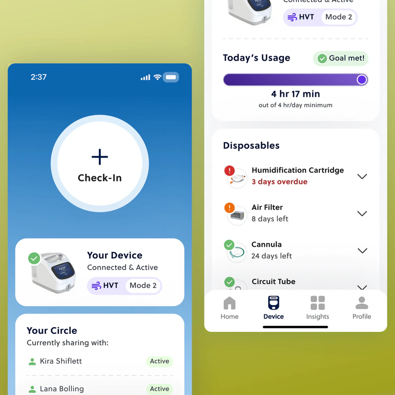
Vapotherm builds respiratory therapy devices for hospitals. Now they wanted to bring it home.
This is their first step towards exceptional home care for COPD patients, with apps that keep patients, caregivers, and clinicians connected.
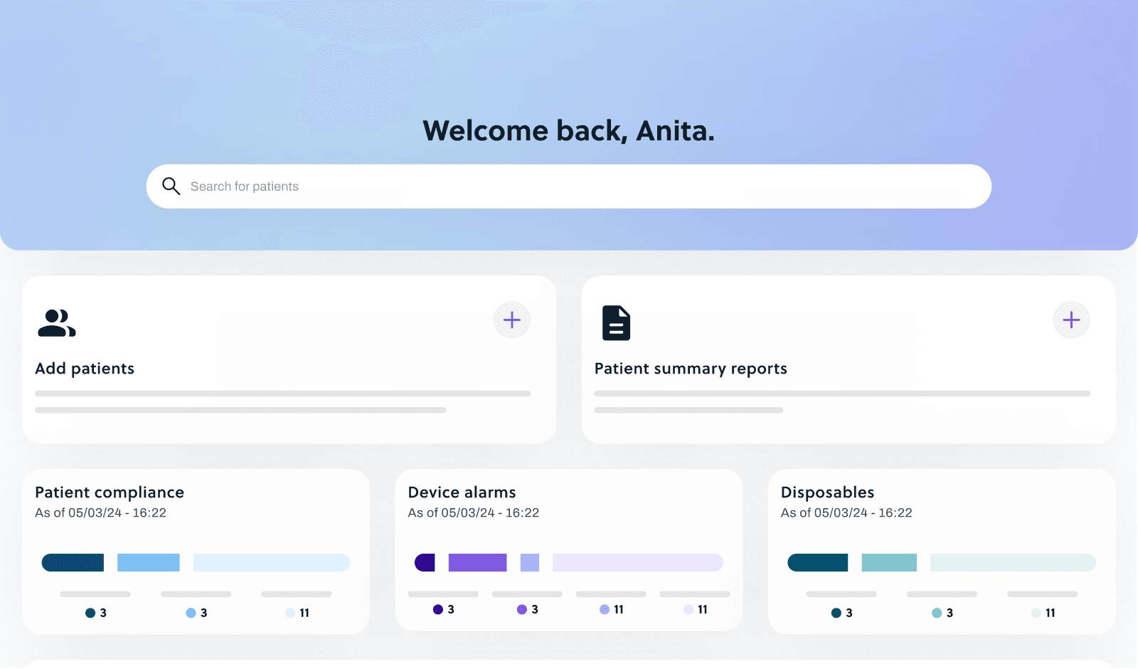
Clinician Support is the clinicians’ side of that, a web portal to...
- Track patient symptoms and trends over time
- Monitor therapy compliance and generate reports
- Manage, assign, and remotely service therapy devices
- Ran research with clinicians and Vapotherm’s clinical advisory board
- Built the information architecture and core flows
- Scoped the MVP alongside product and engineering
- Designed, prototyped, and tested the portal
- Extended the ecosystem’s visual language to desktop
Vapotherm’s devices were designed for the hospital.
Hospital tools assume a controlled setting: patients on a schedule, care team on the floor, and data in one system.
Home devices and their ecosystem need a different design approach.
Vapotherm had the device hardware down. Software to connect and manage that device was new territory.
Early conversations and an internal research report showed us that clinicians are already stretched thin.
Existing workflows with other home care therapy devices were disconnected, outdated, and overwhelming.
Home care gives patients independence, but costs clinicians visibility.
So, we had to ask ourselves a different question.
The problem we were actually trying to solve was much larger than just designing another portal.
How do we design a portal to interface with the home therapy device?
How do we help clinicians support independent care that happens on the patient’s terms?
Where could the portal make the biggest difference?
To hit the MVP deadline, we had to narrow our scope to the essentials.
Research kept pointing back to three recurring problems. Solving them would do the most for clinicians.
Lack of visibility
Patients fit therapy around their own lives. Clinicians only see what they report, and that’s rarely the whole story.
When clinicians can’t see what happens between visits, decline goes unnoticed until it turns into a hospital stay.
Compliance & Insurance
Fewer check-ins mean a missed therapy session can go unnoticed until coverage is on the line.
When non-compliance goes unnoticed, patients can lose coverage for the device keeping them out of the hospital.
Scattered patient data
Every practice runs differently, and patient data is spread across EMRs, patient portals, phones, email, and even fax.
If data is scattered, clinicians spend their time searching instead of treating, and critical changes get missed.
How do you know which patients need you the most right now?
I ran a card sort to find out what data mattered most to clinicians at a glance.
I designed quick-view cards that rank compliance status, device alarms, and disposable replacements by urgency.
Everything critical sits at the top; everything else is one click deeper.
How do you catch a lapse in care before it happens?
I flipped the workflow: clinicians don’t go looking for the problem. It comes to them through automatic reports that flag at-risk and non-compliant patients.
When they need more, they can build and save a report on the spot, for their whole panel or a single patient, right from the dashboard.
How do you update or fix a device you can’t touch?
Clinicians and techs can check device status, fix issues remotely, assign devices and prescriptions, and push reminders or reorder masks and cannulas, all without a home visit.
I pushed tech-specific fleet tools to the roadmap so we could hit the MVP timeline.
Good news: clinicians could find what mattered.
The core patient data and reporting flows performed well in our first round of testing.
“[the portal was]... thorough enough without being overwhelming or burdensome.”
The tricky part? Acting on it from a distance.
Information-dense screens like device therapy settings and remote servicing struggled during testing.
Heat maps and task recordings showed me exactly where people got stuck, and why.
72% of clicks missed when setting up therapy remotely
Collapsed a multi-step setup into one page
Almost every clinician told us they’d rather see therapy settings on one page than step through a wizard.
60% of clicks missed during remote servicing
Restructured the page so it’s obvious how to close out an issue
Remote servicing was the most confusing flow, so I went back and simplified the page structure.
“There seems to be a lot of information on this page, and I found it to be confusing.”
This was my first zero-to-MVP ecosystem, and my first in a mission-driven medical space.
The design principles stayed the same, but with patients’ health on the line, there’s a real drive to get it right.
Next time, I’d run testing differently.
I’d test smaller and more often to catch structural issues early.
Three rounds with 5 users beats one round with 15.
More data isn’t always better.
Deciding what, how, and when to show it was the real design work.
Listening to clinicians showed me what to leave out.