Patient Support
@ VapothermDesigning an easier way to manage COPD symptoms and support devices.
I led the design effort from zero to MVP. The app is now in FDA testing.
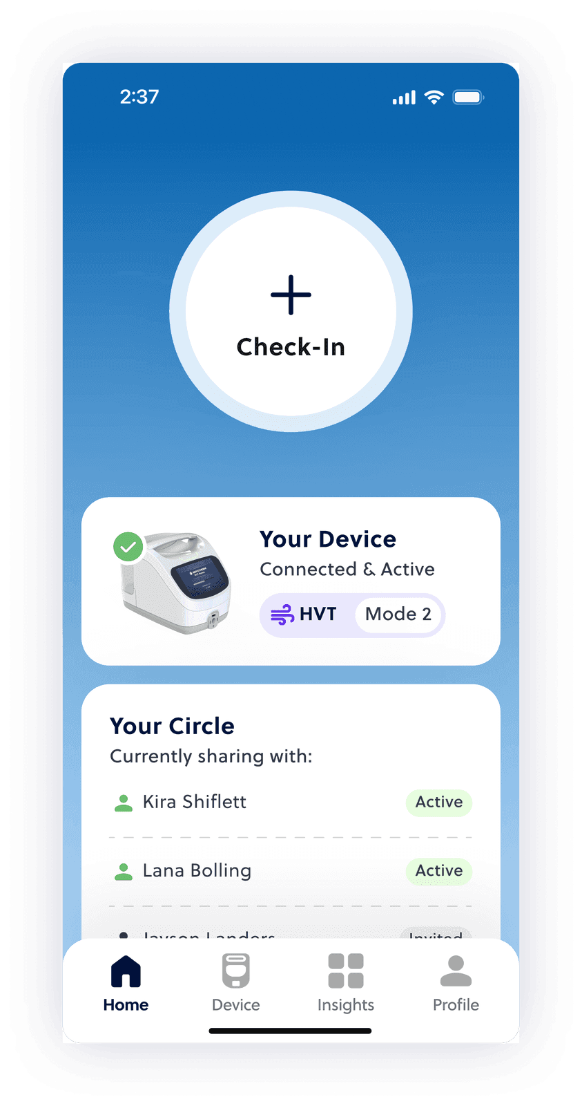
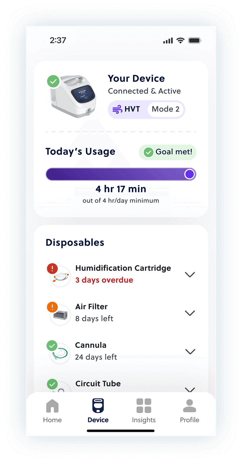
One app to track symptoms, manage oxygen therapy, and keep caregivers close.
Patient Support is a mobile application that gives users a better way to track their COPD progression. It lets users...
- Log and track COPD specific symptoms
- Interface with their prescribed oxygen therapy device
- Connect to their broader support community through a supporting caregiver app
- Conducted user research, interviews, and testing
- Synthesized research insights into actionable items
- Defined & mapped core features for MVP
- Designed concepts & prototypes
- Established visual language across ecosystem
- Created complete experience for MVP launch
COPD is exhausting to live with, and the tools around it were making it harder.
COPD is an incredibly taxing and restrictive disease to live with. Yet COPD symptom tracking, management, and therapies are still clunky, outdated, and restricting.
Individuals with COPD deserve care and symptom management tools that support and enable a flexible life, even on their toughest days.
3 major gaps surfaced from an internal research report
- Outdated symptom tracking -Pen & paper or clunky mobile apps make it difficult for patients to connect actions to outcomes.
- Unintuitive device information -Patients struggle to navigate device errors or complete necessary device maintenance.
- Community support -Patients want to share their symptom status with caregivers, even if they aren’t in the same country.
Make support feel steady, even when health isn’t.
- Support patients, even on their toughest days
- Make consistent symptom tracking a habit
- Enable increased independence in patients’ lives
- Create a secure & transparent ecosystem connecting patients, caregivers, and clinicians
Two rounds of testing on a tight budget showed us exactly where patients got stuck
I mapped core flows for both the patient and caregiver apps and prototyped each.
We ran two testing rounds: one early to pressure-test the groundwork, one focused on core MVP tasks.
Initial testing findings -
Abstract icons confused users, so I swapped them for things they already knew
Real world icons & comparisons like "thin, like milk" made hard to describe textures easier to relate to.
Older users kept missing taps in critical flows, so every target got bigger
I set a 52x52dp minimum and increased text size to meet AAA standards.
Secondary testing findings -
Usability landed at 81% for patients and 78% for caregivers. Heat maps showed where the rest was hiding.
Most taps were missing the button, so the whole card became the button
- 81% of clicks missed when users investigated symptoms
- 45% of clicks missed when adding a caregiver
Users weren’t just tapping CTAs; they tapped wherever the card looked like it led. Heat maps sorted the fix into two cases:
- Add entry points where users instinctively tap
- Make the CTA unmistakable with spacing, size, or an icon (or all three!)
My first ground up ecosystem taught me to plan research around constraints, not in spite of them
Being a solo UX designer on the team forced me to wear many hats and showed me that being able to learn and adapt on the fly is key in fast-paced environments.
My favorite firsts of this project...
- Research and user testing planning with budget and timelines in mind.
- Crafting multiple elements of the product ecosystem from scratch...
- Complete information architecture
- Visual language building blocks
- Basic design library